Mobile friendly sites
with responsive design
Rupert Breheny
September, 2012
Rupert Breheny
September, 2012


Mobile devices (smartphones and tablets) are our fastest growing visitor segment. And yet we’re still building site layouts like it’s 1999.
We should be utilizing mobile-compliant best-practice techniques to ensure the optimum user experience, and making a habit of testing our new pages at narrow widths and on a variety devices.


Identifying mobile rendering issues
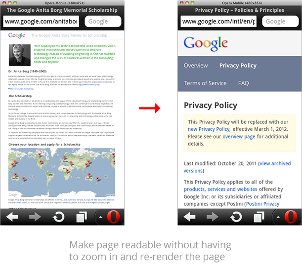
Does the site zoom in to a readable level by default?
Most mobile phone browsers will render a standard web page as if at 800px width or higher, but the text becomes too small to read without zooming in. Adding a viewport meta tag makes the site more legible.
<meta name="viewport" content="width=device-width, initial-scale=1, minimum-scale=1">
Creating your own liquid layout
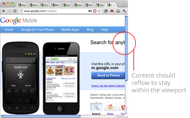
Do the copy and images reflow in a narrower page layout?
Never use a fixed pixel value on the width or height property of a container element. Instead max-width and min-height will do exactly what you need:
				body {max-width: 978px;}

				.boxout {min-height: 200px;}
If you do require legacy support for IE6 then use an IE6 specific syntax hack:
* html body {width: 978px;}
However it is advised to refrain from doing so in order that IE6 may preserve the flexible layout.
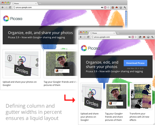
Do your columns resize proportionally with the browser width?
Rather than specifying pixel widths for columns, choose percentages for both the column and gutter such that they total 100%.
				.column {

					  float: left;

					  margin-right: 2%;

					  width: 32%;

				}


				.column.last {

					  margin-right: 0;

				}
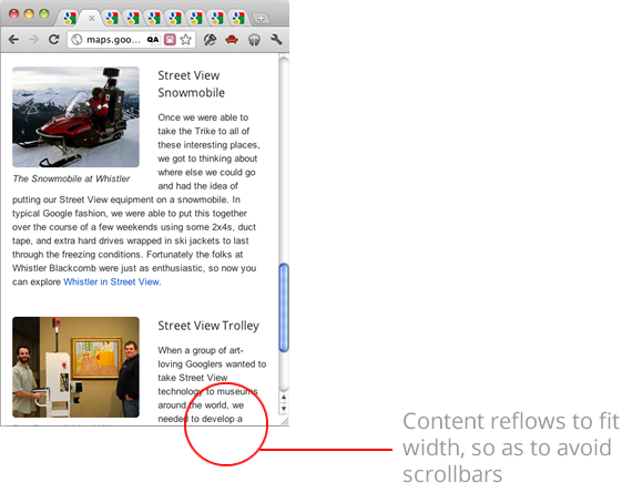
Are horizontal scrollbars avoided?
Sometimes images or other page elements can clog up otherwise liquid container elements. A simple fix that prevents this behaviour is as follows:
				img, iframe {

					  max-width: 100%;

					  box-sizing: border-box;

				}


Does content behave itself at different screen sizes?
Sometimes layout issues are triggered at narrower screen widths. Always check your site at different window sizes, as not everyone has the luxury of 30” monitors. Often adding an overflow property is a fix for escaped content:
.container {overflow: hidden;}
Caution should be observed when using media queries as a proportion of browsers still do not support them, but for those that do, they can be a useful method of tailoring content for different classes of browsing device.
				@media screen and (max-width: 600px) {

					  /* rules for narrower viewports */

				}
As a set of basic triggers, the following widths are worth targetting:
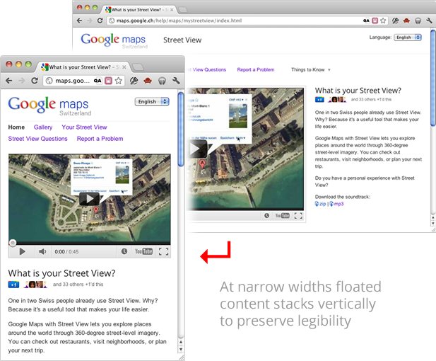
Do multiple columns become stacked to maintain readability?
Narrow columns can be very hard to read at narrow screen widths. By turning inline elements to block, or unfloating containers, this can be avoided. Using media queries to trigger this linearized content is a great technique, but bear in mind this won’t work for the currently 30% of browsers represented by IE8 and below.
				@media screen and (max-width: 480px) {

					  div, li {

					    display: block;

					    float: none;

					    width: 100%;

					  }

				}
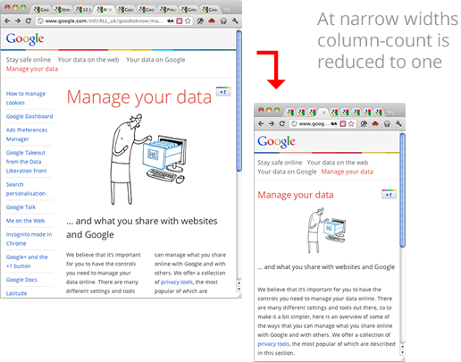
Would content benefit from reflowing across columns?
Line lengths can be kept more readable in generic blocks of text using CSS3 columns. They are supported in most modern browsers and degrade gracefully in IE9 and below.
				.container {

					  column-count: 2;

					  column-gap: 32px;

				}


				@media screen and (max-width: 480px) {

					  .container {

					    column-count: 1;

					  }

				}
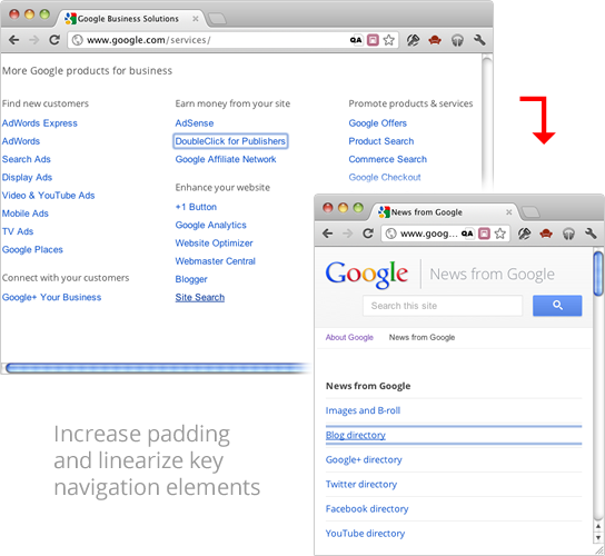
Are all nav links clickable and large enough for fingertips?
Compact lists of links can be quite fiddly on a touch interface. It is recommended to make the minimum hit area at least 44px square. Instead of putting margins between link list items, consider adding padding to the anchor tag itself and linearize the list at low page widths.
				@media screen and (max-width: 480px) {

					  #nav a {

					    display: block;

					    padding: 5px 10px;

					  }

				}
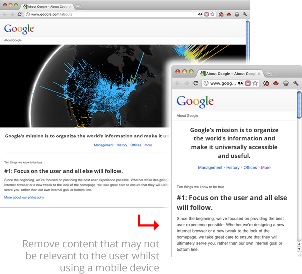
Is all your content useful for users on different devices?
Many of your users wil be viewing your site with limited screen size, or on an expensive data plan. Rather than force them to download extraneous details, consider what content may be optional, and remove it at narrower page widths.
				@media screen and (max-width: 480px) {

					  .optional {

					    display:none;

					  }

				}

Do your images look fuzzy on mobile devices?
Many modern smartphones have a native resolution approaching double that of desktop displays. For crisper images you can make the original twice the size, then scale it down again with CSS. Desktop browsers will display the image at the reduced size, but a mobile device will render it at around its native pixel density.
h1 img {width: 200px;}
This would work for a 400px wide logo in the header. There is no need to specify a height value.
Remember – mobile users may be on a data plan, so use this technique wtih caution.
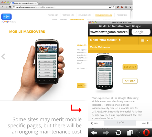
Does the content warrant a mobile-only site?
This approach requires more resources, and can be a maintenance headache, but sometimes a bespoke mobile site can be of real merit.

I'm proud to say that I think it's now the joint project of all of us to make mobile the answer to pretty much everything.

Rupert Breheny